Case Study
Lemonade & Co
Overview
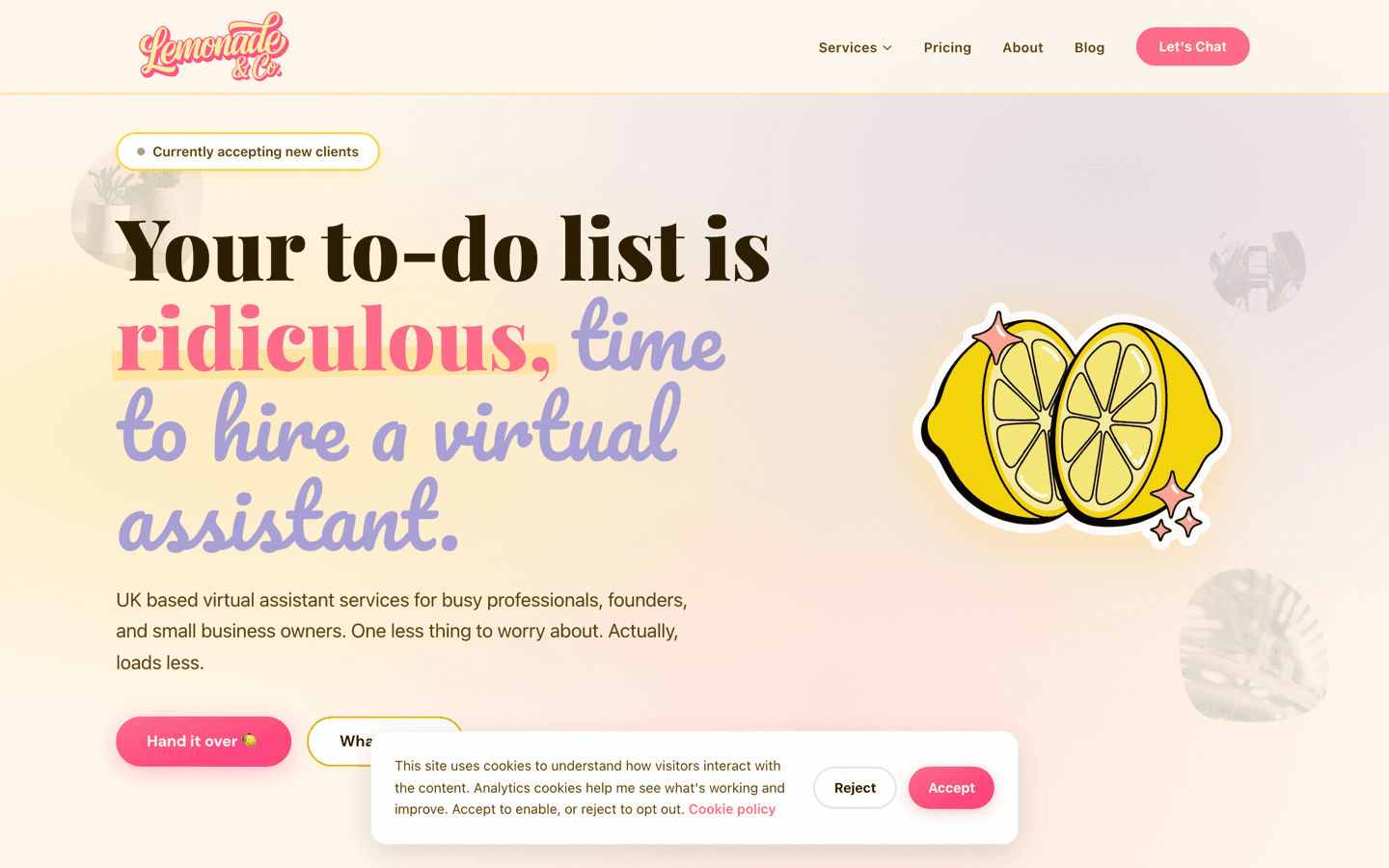
Lemonade & Co is a virtual assistant business in West Sussex, and the brand belongs to its founder, Natalie, my fiancée. She designed it: the lemon motif, the cream and coral palette, the Playfair and Pacifico pairing, the whole cheerful, slightly hand-drawn feel. My job was to build it without quietly turning it into something a developer would have made instead. I shipped a Next.js site with fourteen service pages, three pricing ladders, a booking and enquiry flow, consent-gated analytics, and a blog that Natalie writes and publishes herself. Her design, realised, with none of the odd bits sanded off.
The Problem
Lemonade & Co was a brand-new virtual assistant business with no client list, no reviews and no track record. Everything a prospect would use to judge it had to come from the website. Virtual assistance is a trust purchase; you are handing a stranger your inbox, your diary and your logins. A site that looks generic or thrown together costs real enquiries. It also had to be found, because nobody was going to type the business name into Google. It needed to answer searches for specific services in specific places.
There was a second problem, and it was the one I actually had to solve. The brand already existed. Natalie had designed it: the lemon motif, the palette, the type pairing, the tone. My job was not to design a website. My job was to build hers, and to do it without replacing her decisions with the ones a developer reaches for by default. Left alone, we round off the odd bits. Hand-drawn scribbles become tidy icons, warm cream becomes white, wavy section dividers become horizontal rules, and the thing that made the brand hers disappears one sensible decision at a time.
Constraints
Natalie is a designer, not a developer. What I received was a mood board of sixteen reference images, a colour and type direction, and a static prototype of the look. There was no component library, no named tokens, no spacing scale I could import. Turning that into a system was on me, and every gap I filled was a chance to get her intent wrong.
I also had to accept that I did not have a vote on the design. If something was awkward to build, the answer was to build it anyway, not to talk her out of it.
The budget was a startup budget, which meant one developer, no separate design QA and no long review cycles. The site had to be fast and it had to rank, because paid acquisition was not on the table. And it was her business, her money and her name on it, which is a different sort of pressure to a normal client. You cannot close the laptop and go home when the client lives with you, so the working relationship needed as much care as the code.
Approach
- Write the brand down before writing any code. We turned the mood board into a design system document with named colours, a type scale, spacing, and rules about when each motif is allowed. That document became the thing we discussed, rather than individual pages.
- Convert her prototype into real tokens. The palette and font stack from her static mock went straight into the stylesheet as custom properties, so every component drew from one source and nothing got eyeballed.
- Build the personality first. Before any page existed I built the small pieces that carry the look: the highlighter mark behind key phrases, the wavy section dividers, the recolourable scribbles and organic shapes, the sparkles, the blob-masked photos, the polaroid frames and the rotating stamp badge. Get those right and the pages come out right.
- Model the content, then lay it out. Services became typed data rather than fourteen handwritten pages, so tone and structure stayed consistent and adding a service was a data change.
- Treat search as a build task, not an afterthought. Structured data, sitemap, canonicals and local signals went in alongside the pages.
- Hand her the keys. The blog runs on a gated admin area she logs into and writes in directly, so publishing never waits on me.
- Review on real pages, on a real phone, against a written list. We kept a working site map document with a status per page, so feedback landed as tracked actions rather than comments over dinner.
Solution
- Fourteen service pages generated from a single typed source, plus one bespoke page for website builds carrying three build packages and three aftercare plans.
- Core marketing pages: home, about, services index, pricing, tools, case studies, contact and privacy.
- A blog backed by a database, with categories, tags, related posts, share buttons, an RSS feed, and a rich-text editor with image upload inside a gated admin area. Natalie writes and publishes every post herself.
- Enquiry capture on three routes: a validated contact form that pushes leads into her CRM, a direct email link, and a discovery call booking link into her calendar.
- Spam handling on both forms with a hidden honeypot field and per-address rate limiting.
- Consent-gated analytics. Nothing loads until a visitor accepts, and six events are tracked, four of them treated as conversions.
- Structured data across the site: organisation, professional service, website, founder, FAQ, process, offer catalogue, article, service and breadcrumb markup.
- The design language expressed in code: twenty-six colour tokens, the highlighter mark, wavy dividers, over a hundred recolourable decorative SVGs, blob-masked imagery, polaroid photo frames, a scrolling marquee, a film grain overlay, and a reduced-motion fallback covering every animation.
- Security headers, a strict content security policy, a canonical host redirect and a locked-down image allowlist, deployed to a private server rather than a managed platform.
Outcomes
The site launched, it is live, and the business has never asked me to change how it looks, which for this project is the result that mattered.
What it gives her is concrete. She has a presence that looks like her brand rather than a template, which is the whole point when the product is essentially trust in one person. She has a page for every service she sells, which gives search engines something specific to match against instead of one vague page. She has three ways for someone to get in touch and she can see which of them people actually use. She can publish without me. And the brand is written down, so whoever touches it next has something to work from.
Reflections
I would build the token layer first and write the design system document second. I did it the other way round, and the document has drifted. It still names a display typeface and a palette the site moved away from, so the written record and the live site now disagree. For a brand meant to be recognisable with the logo covered up, that is the wrong thing to let rot.
I would be stricter about what gets loaded. Four typefaces ship and one of them is used for a single decorative badge. That is a small cost paid on every page load for very little in return.
I would put automated checks around the parts that carry the design. There is no test suite, so fidelity is confirmed by looking at it. That was survivable for a launch and it will not scale. The same goes for the deployment configuration; adding a third-party tool later needs a matching config change, and that is exactly the sort of thing a checklist catches and a person does not.
On the handover itself, the honest lesson is that a mood board and a static prototype are a great start and a poor contract. Next time I would spend an afternoon with her turning her direction into named tokens we both agree on before I write a line of code, so that "is this right?" has an answer we can both point at rather than a judgement I make alone.
And on working with a partner: keep the review in a document, keep it in working hours, and never give feedback on someone else's brand at eleven at night.