Case Study
Personal Design System: Foundations
Overview
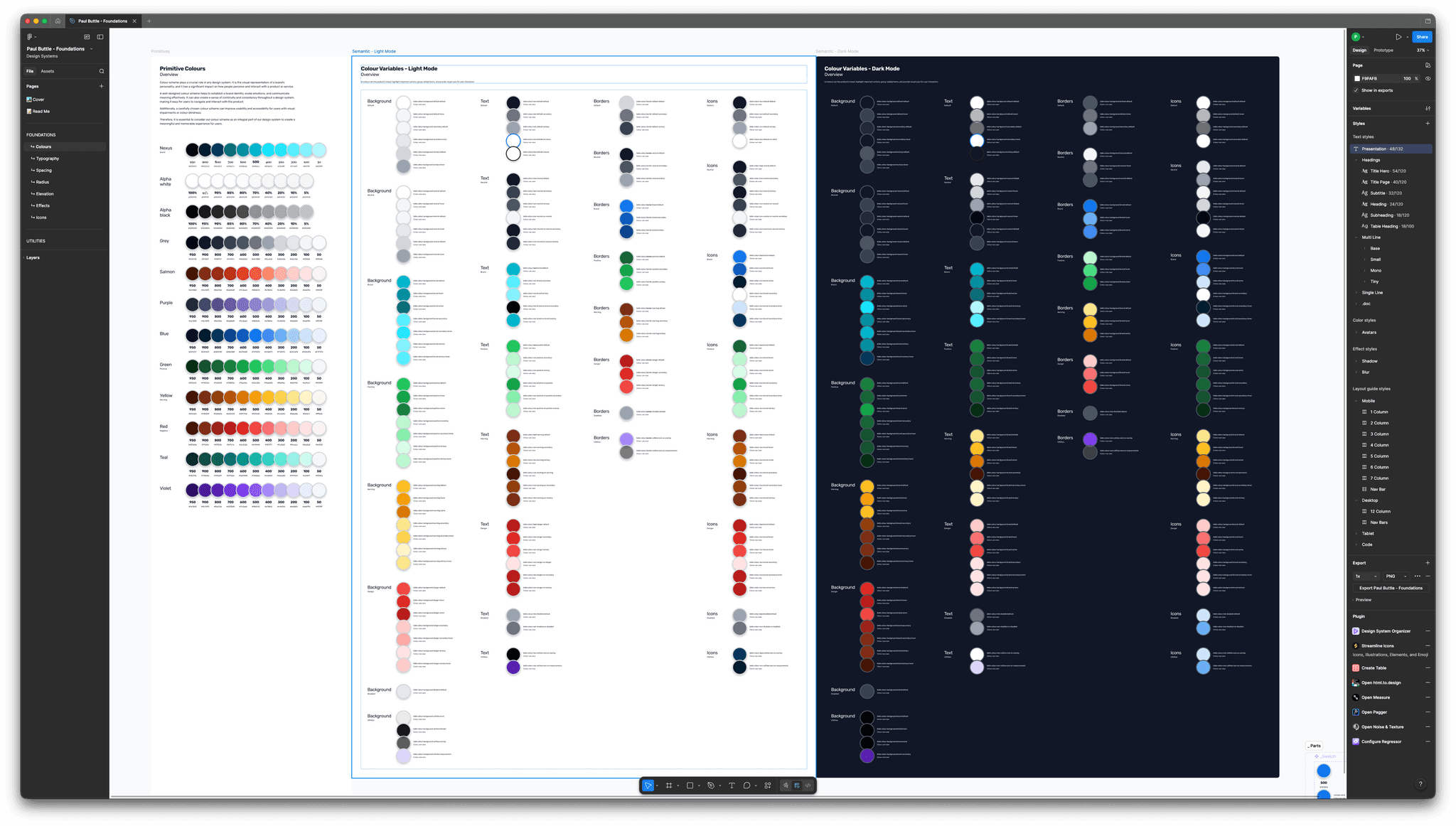
Foundations is my personal, variable-first design system in Figma. Colour, typography, radius, elevation and icons all run through two tiers of variables, primitive and semantic, with light and dark modes and strict scoping. When a new project arrives with a new brand, I remap a handful of values rather than rebuilding components, which in my experience turns days of manual updates into minutes.
The Problem
Every designer has been there. A new project lands, the brand colours are completely different from your last one, and suddenly you're staring down the barrel of manually updating hundreds of components across dozens of files. It's tedious, error-prone, and about as enjoyable as a root canal. I wanted to fix that.
The Approach
I built Foundations, a personal design system in Figma that treats variables as the single source of truth for everything visual. The system is structured around atomic-level design tokens, covering colour, typography, border radius, elevation, and iconography. Every decision flows through Figma's native variables and scoping, which means swapping an entire brand identity is a matter of updating primitive values rather than hunting through component layers with Find and Replace.
The architecture follows a deliberate two-tier token structure:
Primitive tokens define the raw palette. These are the actual hex values, the full spectrum of hues, tints, and shades that a brand might need. Think of them as the paint on your shelf. You probably won't use all of them, but they're there when you need them.
Semantic tokens reference those primitives and assign meaning. A colour stops being "Blue 600" and becomes "Primary Background" or "Error Border". This is the layer that does the real work. Because semantic tokens point to primitives rather than hard-coded values, rebranding becomes a simple remapping exercise. Swap the primitives, and the entire system updates in seconds.
Light Mode, Dark Mode, and Everything Between
Both light and dark mode are handled through variable modes, scoped so that background colours can't accidentally end up applied to text, and border tokens stay in their lane. The scoping is deliberate and strict because a flexible system that lets you do the wrong thing easily isn't really flexible. It's just messy.
What's Covered
The system's foundation layer includes:
- Colour: a comprehensive primitive palette feeding into scoped semantic variables for backgrounds, text, borders, and interactive states across both light and dark modes.
- Typography: variable-driven type scales that control size, weight, and line height, keeping text styles consistent without manual overrides.
- Radius: token-based corner radius values, from sharp to fully rounded, applied consistently across every component that needs them.
- Elevation: depth through layered shadow tokens that adapt across themes, so cards and modals feel grounded regardless of the surface they sit on.
- Icons: a cohesive set within the system, sized and coloured through the same variable pipeline as everything else.
The Result
The practical upside is straightforward. When I start a new project, I don't rebuild. I reconfigure. Updating the primitive colour palette and a handful of semantic mappings transforms the entire system to match a new brand, and every component built on top of those foundations follows suit automatically. In my own work, what used to take days now takes minutes, and the consistency is baked in rather than hoped for.
It's not glamorous work. Nobody's going to look at a spreadsheet of colour tokens and feel inspired. But it's the kind of foundational thinking that makes everything built on top of it faster, more reliable, and significantly less painful to maintain. And honestly, after years of doing things the hard way, I'll take "less painful" as a win every single time.